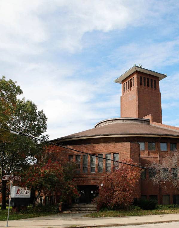
Few churches can match the importance of St. Paul’s United Methodist in Cedar Rapids, Iowa in the history of American architecture and religious education. It is a landmark on the American prairie, reflecting a beautiful and unique blend of congregational vision and architectural genius. And now it is a participant in the National Fund for Sacred Places.
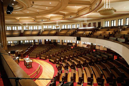
Sanctuary of St. Paul’s
Photo: L. J. Schneekloth Photography
In 1913, when this fast-growing congregation needed more space for education, ministry, and outreach to the community, it gave architects in the Midwest an opportunity to design a new facility that reflected its “seven-day a week” approach to ministry. The new facility would need to express the congregation’s “muscular Christianity,” a hard-working, civic-minded and energetic form of religious faith that was active in the life of the community. None of the designs was satisfactory, save that offered by Louis Sullivan (1856-1924) the visionary designer who has become well-known as a prophet of modern architecture, and had an enormous, lasting influence on Frank Lloyd Wright and other masters of 20th-century design. The opportunity was serendipitous. While based in Chicago for most of his career, Sullivan lived briefly in Cedar Rapids when St. Paul’s decided to build a new church.
St. Paul’s innovative concept was a good fit with Sullivan’s unique style that emphasized functionality and purpose, enriched with a complex, unique approach to ornament. Sullivan’s major works include the Auditorium Building and the Carson Pirie Scott department store in Chicago, but he is best known for early skyscrapers such as the Wainwright Building in St. Louis that emphasized the verticality of this new form of urban architecture. Later he was known for designing a series of small bank buildings not far from St. Paul’s that demonstrated his unrivaled creativity, juxtaposing florid decoration and severe, architectural geometry.
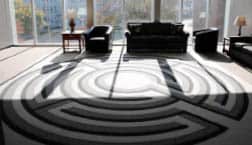
Common room in new connector building
Photo: L. J. Schneekloth Photography
Sullivan’s initial designs were modified by the congregation, in part to save costs, so he eventually resigned from the project. Even so, much of Sullivan’s design was respected. If anything, the pruning of ornamental touches further emphasized the modern shapes that characterize the design. The bold curved format of the main worship space or “auditorium,” along with the distinctive shape of the tower and its landmark illuminated cross, were strikingly modern in their severe shapes and bold lines. While decoration was relatively sparse, Sullivan’s well-known doctrine of “form follows function” is reflected in one of the most interesting details of the complex. The two main entrance staircases for the auditorium are expressed as major elements in their own right, emphasizing their function and creating strong visual features for the main facade.
Sullivan’s design was also revolutionary in its plan. While many churches across the nation were continuing to build Sunday Schools on the 1860s-era Akron Plan (with an open rotunda circled by one or more tiers of classrooms), Sullivan provided a new and modern alternative that reflected up-to-date educational pedagogy, with separate classrooms for each age group organized along a double-loaded corridor.
Renewing the Vision for Modern Challenges
Though Sullivan’s design of St. Paul’s was forward-thinking in 1913, over time the building no longer met all of the needs of a modern and growing congregation with evolving programs. Like countless congregations across America, in the mid-20th century St. Paul’s constructed another building to house educational programs. And as travel by car became an increasingly everyday occurrence, the congregation purchased property across the street to create a parking lot.
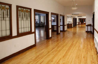
Gathering spaces adjacent to sanctuary
Photo: L. J. Schneekloth Photography
Likewise, the community around St. Paul’s changed dramatically over the last hundred years. When Sullivan’s design was built, the church was situated at the edge of the city, near the local fairgrounds. Later, Cedar Rapids expanded so much that St. Paul’s location is now seen as a part of the larger downtown area. It is surrounded by neighborhoods with residents from a wide range of economic classes. An influx of refugees and immigrants from several African countries is now reflected in the church’s membership and cultural traditions.
After a century of changes in and around the church, St. Paul’s found itself dealing with a facility that no longer met its needs. Jade Hart is an active member of the church who served on the building committee through the recent capital campaign. As she explains, “Things were different in 1913… The old entry was a split-level, and you had to go up or down as soon as you got in the door… We used to have at least five entries and people didn’t know where to go.” In addition, worshippers needed to cross the street from the parking lot, so safety was a growing issue. All of this left some members wondering if it was time to move to a new location outside of town.
Instead of relocating, St. Paul’s made a clear decision to stay in central Cedar Rapids, embrace its unique facility and neighborhood outreach, and reinvest in its downtown community. The congregation embarked on a multi-million-dollar capital campaign to renovate its buildings and reimagine how the campus is organized to welcome people.
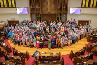
Gathering in the sanctuary
Photo: L. J. Schneekloth Photography
In the end, the church raised over $5 million, including nearly $1 million in historic tax credits provided by the state of Iowa, and a $250,000 grant from the National Fund for Sacred Places. The project included thoughtful renovations of several areas in the historic Sullivan-designed building, including remodeling of a central gathering space on the main floor of the building, restoration of historic stained glass windows, and the fabrication of furniture using elements of historic doors and trim removed from the building.
The project also included wholesale renovation of the education building, with a more open office plan and better functioning classroom spaces for music rehearsals and early childhood education programs. Finally, the project completely reconstructed the connecting areas between the two buildings, with increased natural lighting, prominent entryways from front and back of the building, elevator access to all levels, and fully accessible restroom facilities. The result is a stunning integration of spaces designed in three distinct eras, with an unmistakable and welcoming front door.
Reflecting on the changes, Jade Hart says, “I think it’s been life-changing.” Rev. Sherrie Ilg, Lead Pastor, adds, “Before we never saw one another… Now we cross paths all the time. We have better interactions with our staff… So it has been fantastic.”

